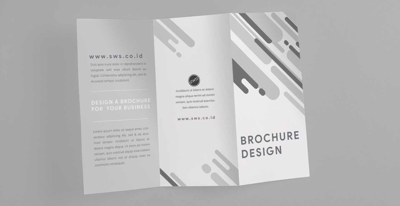
Designing a brochure for promotional activities is easy. But designing a brochure that a potential customer will keep is not easy.
Brochure design must be effective in displaying product and service information that can be accessed by potential customers. The more effective your brochure design is, the more likely it is that the brochure will be stored and distributed to other potential customers.
Table of Contents
How to Design a Catchy Brochure?
Brochure design is not just about the image or layout used, but a combination of elements that work together harmoniously and make brochure design more effective.
Elements such as fonts, content, and type of paper for printing brochures should be carefully considered. So that the resulting brochures bring in leads and increase sales.
There are several things that must be considered when designing brochures for promotional activities in your company.
1. Determine the Purpose of Making the Brochure.
The first step we have to do is identify the purpose of the brochure. This will determine how promotional activities using brochures will work.
- Who will we distribute this brochure to?
- Which segment is the audience included?
- How do we distribute it?
- What benefits do we expect from the brochures we distribute?
The questions above will provide conclusions and directions for us to get an effective brochure design.
2. Determine the Fold Brochure.
The distinctive feature of brochures is that they are folded, there are different types of folds in use today. This must be considered because the folds in the brochure can control how product and service information is presented to potential customers.
We must choose the right brochure folds in accordance with the products or services we offer. So that when prospective customers open the folds of the brochure, the information they receive is conveyed sequentially.
3. Check Copywriting On Brochures.
One of the most important things in the design of a brochure is how to present the content to the reader, by presenting the right meaning and purpose of the brochure that we share will be conveyed to the reader.
Check the copywriting on the brochure again. Does displaying too much information overwhelm the reader? Is the information too short?
Read How To Design a Catalogue
The information displayed on the brochure should be concise and attractive, meaning that we must be able to convey valuable information to potential customers in a short time.
Adjust the number of words with the brochure design, because it will affect the beauty of the design.
4. Choose the Right Font.
In a brochure, there is usually a title, subheading, and content. We must choose the right font to use in each of these sections.
To make it look more attractive, don’t use too many fonts in the brochure design. Three types of fonts are sufficient for each text.
Fonts greatly influence the design of a brochure, define its style, and influence its visual appeal. If you’re new to typography, I highly recommend looking for font combinations that can work together and come up with an eye-catching design.
5. Select the appropriate paper type.
Choose the type of paper that will be used to print your brochure and consider whether or not to use coated paper.
For some people, the type of paper and its coating can influence their perception of your company. Brochures with thicker paper stock with a glossy or matte finish will give a more luxurious feel than brochures with lighter paper types.
The type of paper will also affect the durability of the brochures that we make. Heavier types of paper usually last longer than lighter ones.
This layer of paper can protect the brochure from smudges and scuffs and make the brochure brighter colours.
6. Use Photos With High Resolution.
Don’t use blurry, broken, low-resolution photos in a brochure design, this will reduce the quality of the design. To get a more effective brochure design, image quality is very important.
To display product images on a brochure, make sure the images are arranged in a way that is visually appealing. Use the services of a photographer to get guaranteed photo quality.
7. Insert a Call To Action.
A call to action is a message or invitation to readers to do something. Such as, contact us via WhatsApp, visit our website, visit our store and other requests.
This is the part where you direct the reader to do what you intended yourself to do when creating the brochure. The call to action section is very important in a brochure because it greatly affects the conversion of promotional activities.
Make the call to action clearly visible to the reader, using visual cues like larger font, a different colour or the white space around it to make it stand out even more.
In order to get a better response from readers, including special discounts. Coupons, promo prices or special promos will encourage readers to make the call to action they want.
Conclusion
After you read a few points on how to make an attractive brochure, then you already understand what things need to be considered when making a brochure. Plan your brochure design well to get a brochure design that catches the attention of potential customers.
If your company does not have a design team to design a brochure, please contact SWS Digital Agency via the contact page. Our team will help you design the brochure according to your wishes. We will also help you print brochures with quality materials and printing machines.
Visit our Facebook and Instagram pages for the latest information on digital marketing.
Creative Digital Agency
Layanan & Jasa
Kami memberikan layanan terbaik untuk setiap client kami, dengan harapan bisnis mereka dapat berkembang dan meningkatkan omset penjualan melalui digital marketing.
Tidak semua bisnis dapat di kembangkan dengan metode yang sama, ada perbedaan antara satu bisnis dengan bisnis lainnya. Oleh karena itu dibutuhkan tim kreatif yang dapat menemukan strategi digital marketing yang tepat untuk bisnis Anda.
1 Comment
Comments are closed.


[…] Read : How To Design a Catchy Brochure […]